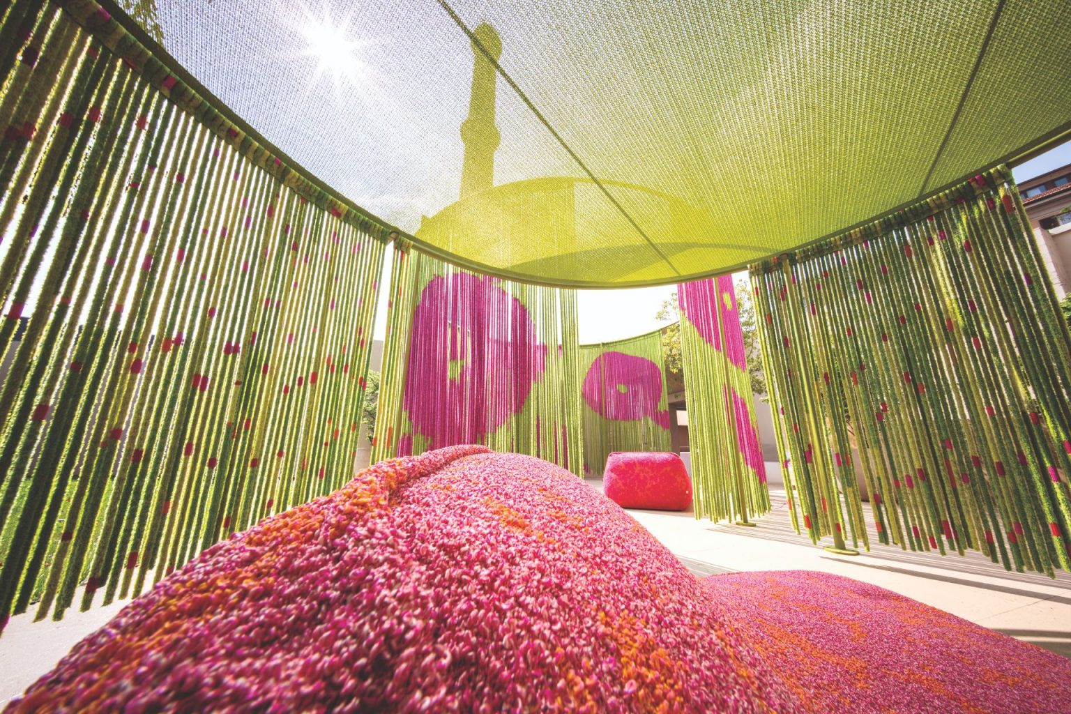
During Milan Design Week, the brand launched a method that reveals the entire brand universe
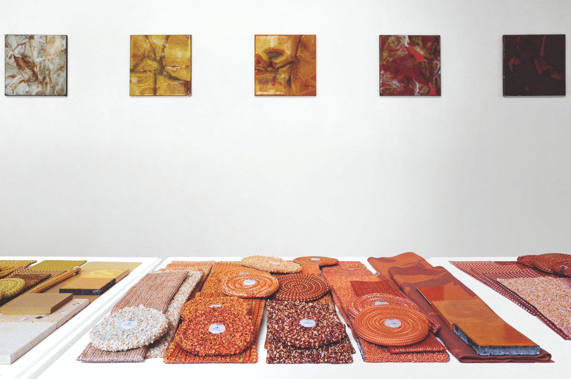
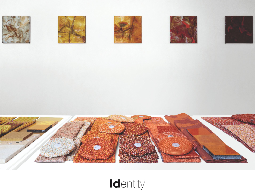
Research and experimentation has guided the work of Paola Lenti for more than 30 years. This year at Milan Design Week, the brand unveiled ‘The Chromatic Alphabet’ — a method that reveals, at a single glance, the entire Paola Lenti universe, while also offering a concrete and intuitive tool for designers.
The unique method has been extracted from the path that has enabled the company to define a distinctive, authentic and coherent design language, thanks to a rich and layered heritage of colours, fabrics, rugs, materials and surfaces. More than 40 shades have been identified, all inspired by nature and translated into the company’s textile and material vocabulary.
Each colour family brings together all the materials available for creating Paola Lenti products – fabrics, cords, weaves, lava stone surfaces, concrete and ceramics. Once a chromatic direction has been identified, it is possible to move freely within it, exploring all its possible combinations and shades. This approach makes each designed space exclusive and unmistakable.It took over a year of research to transform this complexity into a functional tool for designers—a definitive guide to navigating an intricate creative universe defined by its profound depth and nuance.